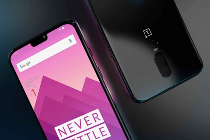
There is a large movement in web design toward mobile first sites, and for good reason. A rising majority of searches originate on mobile devices, and man purchase and transactions also take place there.

However, when it comes to content marketing, SEO, and web design, from time to time the temptation is to focus on one thing so much that others do not get the attention they deserve. There is nothing wrong with thinking mobile first when it comes to websites, especially if data shows you that is where the majority of your traffic comes from, but of you start to lean toward the extreme of mobile only, you are going to miss out on some very important things. Once you have your domain name, web host, and an idea about design, you need to know a little more.
Responsive Sites
The reason we started with responsive websites was the beginning of the trend toward mobile searching and browsers on both phones and tablets. While the number one place to optimize a site for was still a desktop or laptop, the switch was underway.
The evolution was slow, from sites that adjusted size and font, but that essentially had the same menus to sites that were more responsive and adapted menus and photos that loaded faster.
Still, this was a far cry from mobile first sites or those truly optimized for mobile. Still, these sites taught us something: mobile and desktop sites were not the same, but making sure both worked efficiently were of nearly equal performance.
Responsive sites still have a place, and tools to create them are better than they ever have been. However, there are new options as well. Responsive sites were just the beginning.
AMP Compliance
The search giant Google recognized early the rise in the adoption of mobile search. All of the data they had showed this rise. The issue was that many sites, though responsive, were not optimized properly for mobile which resulted in a poor user experience.
The key, of course, was to get the big tech companies on board, and as soon as Google launched the open source program, they did just that. The advantage they had over Apple News or Facebook was that anyone could use their program.
To incentivize this use, Google gave sites that were AMP compliant a search results boost. Pretty quickly, it seemed like everyone was on board.
The other key was marketers. For AMP to pay off, ads needed to be a part of the program, and they quickly were. Marketers jumped on board as well, and now it is almost more unusual to find a site that is not AMP compliant than one that is.
Since HTTPS was required, this made the mobile web more secure as well. Google knew what they were doing, and as a result users have come out ahead. They have better mobile sites that load faster and are more responsive.
In turn, this results in more site visitors and higher conversion rates for businesses as well. More pageviews, more read throughs, and overall more clicks and traffic are all benefits of a site that is AMP compliant.
This doesn’t mean you have to sacrifice functionality on your desktop version. AMP compliant sites actually work really well on multiple platforms, exactly what Google had in mind.
The Need for Speed
Responsive sites and the amp project have both had the side effect of raising website searchers’ expectations. Studies show users will wait about 4 seconds for a site to load, and then will bounce to another that will load faster.
This includes every portion of your site, from the homepage, photos, and video to simple landing pages and blog posts. The longer it takes your site to load, the worse the user experience.
Google knows this too, and so a slow site not only affects traffic and conversions, but it also affects your search engine rankings. The smarter Google gets, and the faster sites load, faster sites will see better results. This does not mean that SEO and other keywords don’t matter: on the contrary, they do. Google needs to know where your site should rank as well as why.
This is why you can’t compromise content for speed. Users respond well to photos, videos, and other visual media. Leaving them out in the name of speed will only have a negative effect on your reach and rankings.
Speed is the key to getting and keeping the attention of readers, and easing navigation, site search, and more.
Check This Out
There is one final step in the buyer’s journey that is happening more and more frequently on mobile devices, specifically phones, and that’s the checkout process. In many responsive website, the shopping cart was still set up ideally for desktop.
Part of the reason for this was customer adoption and trust. The desktop or laptop was perceived, whether correctly or incorrectly, as a more secure platform. However, with advances in mobile technology and secure systems like Samsung Pay, Apple Pay, and other NFC systems that don’t even share your card information with the vendor, this is no longer true.
More frequently than ever before not only do customers perform more searches on mobile, but they also complete their purchase there without ever transitioning to a desktop. This means your checkout process must not only be fast as mentioned above, but it needs to be secure and mobile friendly.
The more types of payment you take, the more likely your customer will feel comfortable checking out with you, and will spend more. In fact, studies show that adding one payment method often results in a 20% increase in revenue.
There’s nothing wrong with a mobile first site. In fact, with AMP and other initiatives, it simply makes sense. However, don’t neglect the desktop user, and make sure your site functions well on both, is fast, responsive, and secure no matter what device the individual uses to access it.


